
The 2026 NWSL season is upon us, bringing a fresh lineup of kits to evaluate!
While the season officially kicks off on March 13, the real competition for the best and worst kits begins now with a look at the primary, secondary, and third jerseys for the year.
Each team has revealed at least one new kit, with the Boston Legacy and Denver Summit making their debut this season, each introducing two kits to the lineup.
Some teams have embraced bold fashion and artistic influences, resulting in standout designs, while others have opted for minimalist styles that convey strength. Some kits are eye-catching, while others fall flat. Though style is subjective, we are here to rank all 18 of them!
– How to watch ‘NWSL: The Final Third’ on ESPN
– Stream LIVE NWSL matches on ESPN+
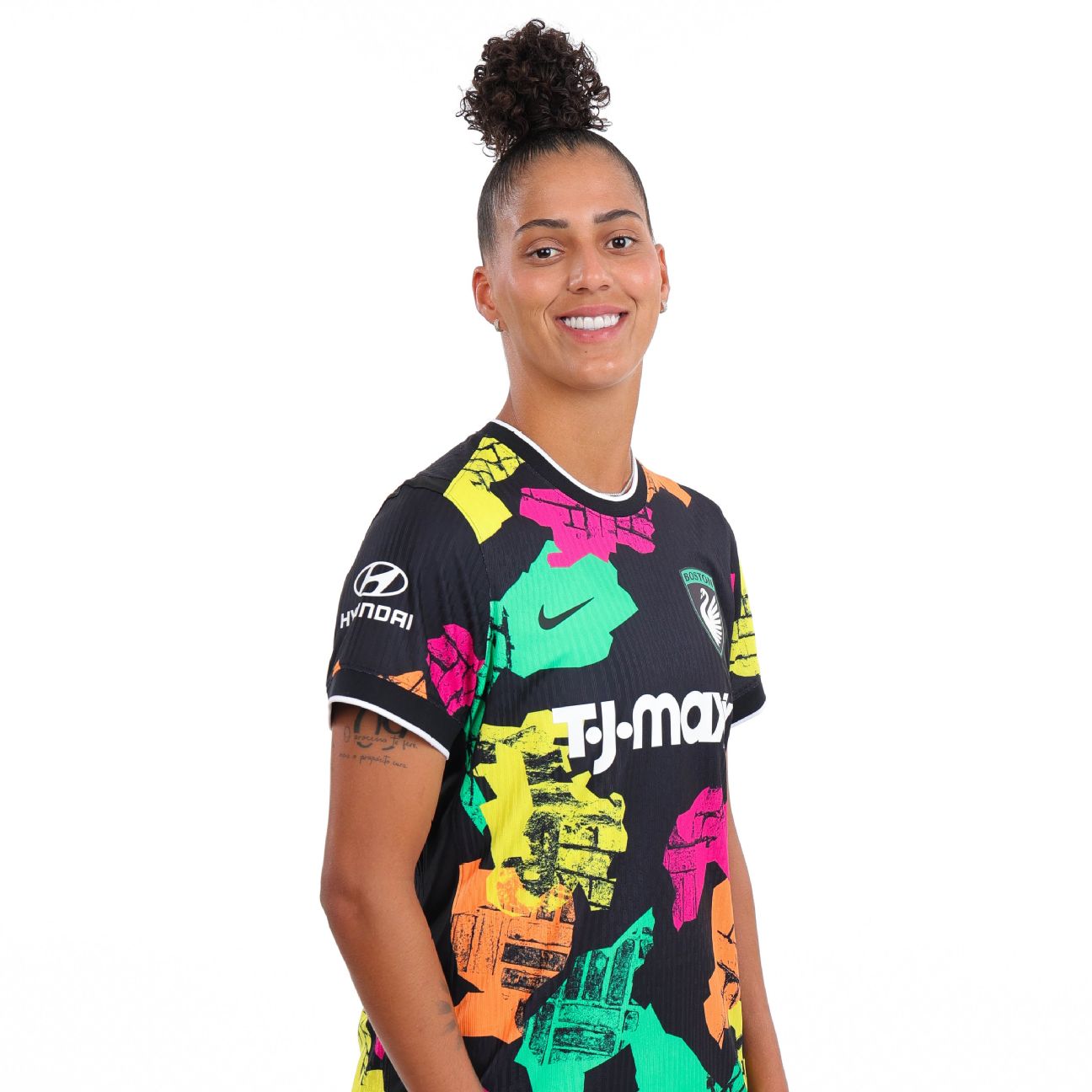
Boston’s “Common Ground Kit” attempts to celebrate the unity of the neighborhoods surrounding its stadium, but the design veers into distraction, overshadowing the intended message. Lacking recognizable neighborhood emblems, it struggles to convey its purpose. The color scheme, reminiscent of the 1990s, feels outdated rather than nostalgically retro, landing it at the bottom of this year’s rankings.

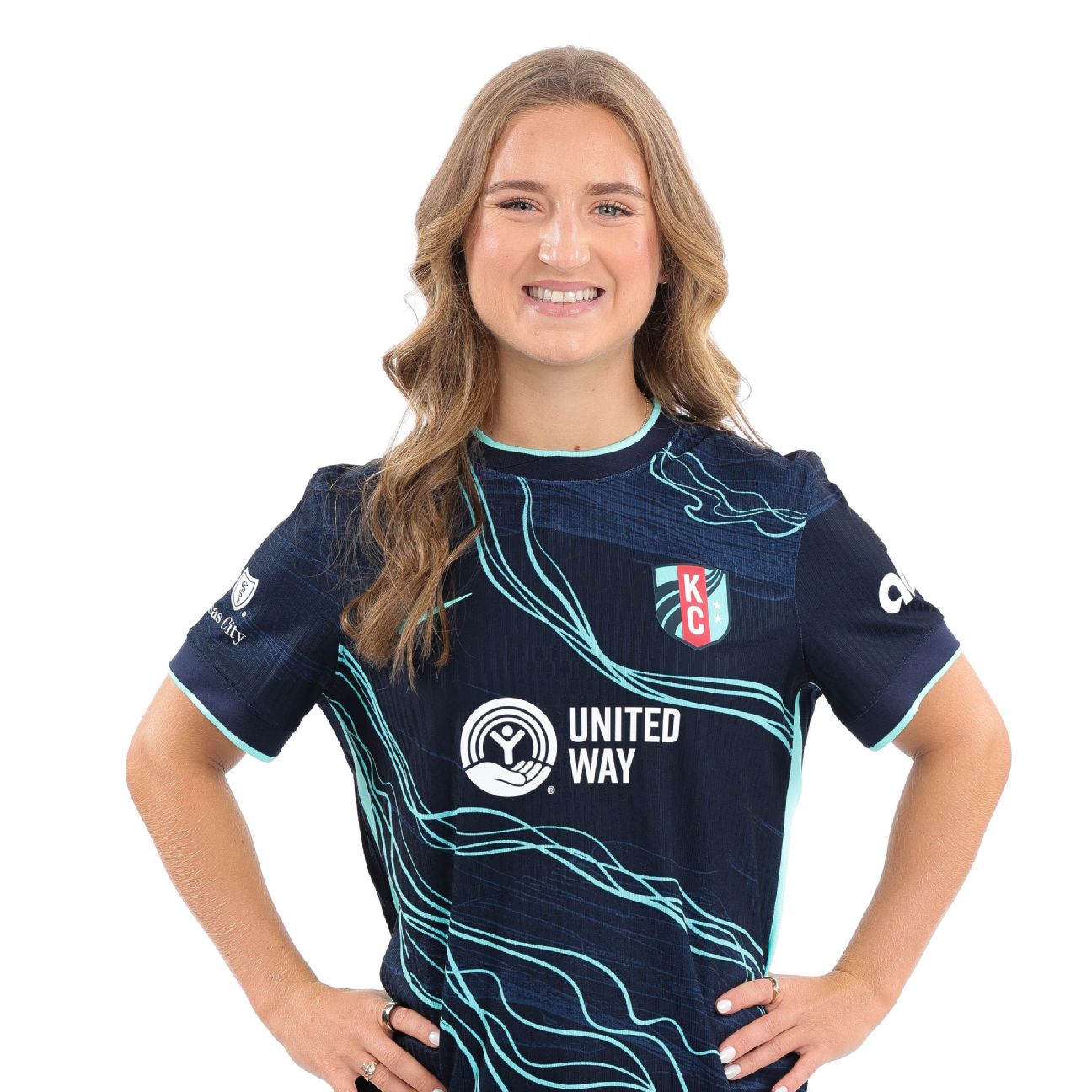
Denver Summit’s effort falls short, especially given Colorado’s stunning landscapes. The jersey leans toward a simple and clean aesthetic but lacks inspiration. With such abundant natural beauty to draw from, the secondary kit could have embraced more creativity.
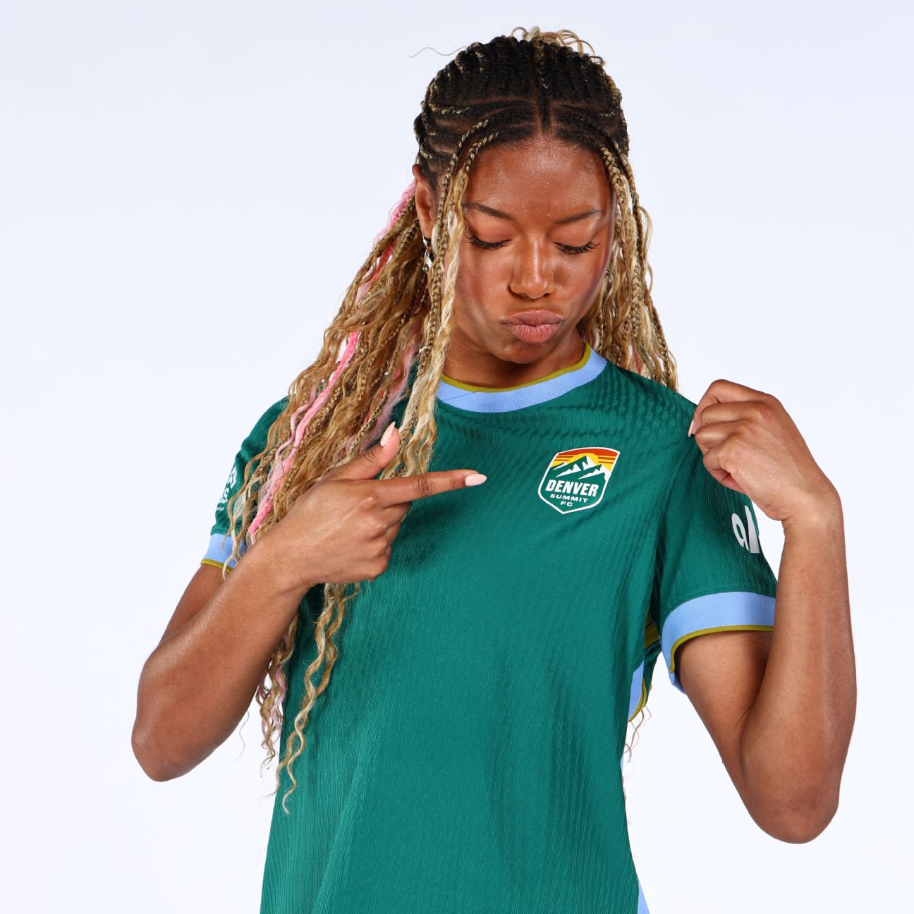
Denver’s primary kit ranks slightly higher; it fits the classic jersey mold. Named the “Inaugural Evergreen Kit,” the pleasant shade of green is intended to evoke Colorado’s Front Range pine forests.
15. Bay FC third kit
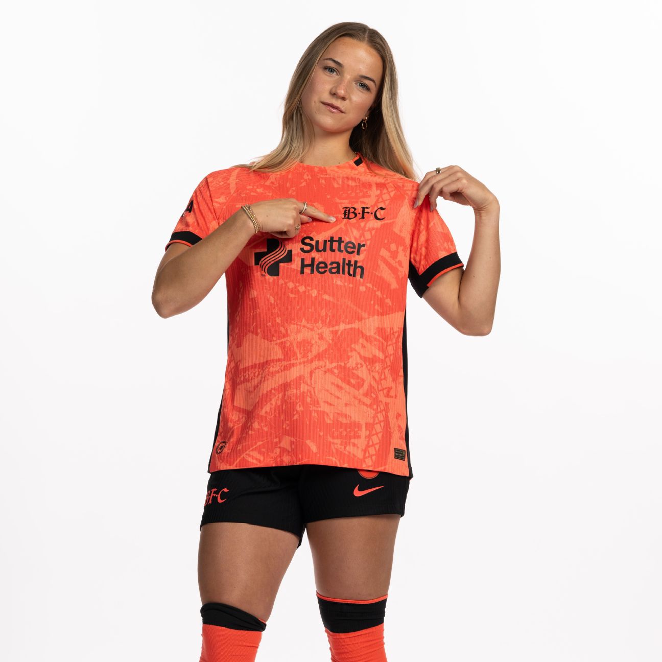
Bay FC’s “Poppy Kit” reflects its namesake but could have benefited from a more pronounced contrast between the red and black commonly associated with the flower. While the effort is commendable, it lacks the boldness needed to stand out.
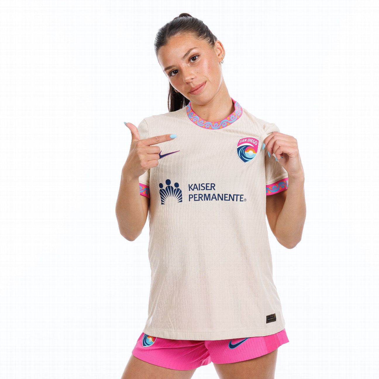
San Diego Wave’s “Balboa Park Kit” had high expectations to meet following previous iterations. While the sleeve and collar details are intriguing, they needed to extend throughout the jersey to elevate its overall appeal.
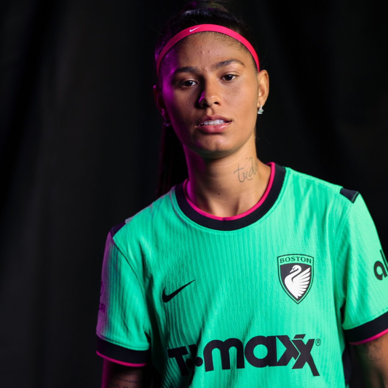
This kit makes a statement with its striking green, a color not found in other NWSL teams’ lineups. Although it may be simple, the Boston Legacy’s “First Light Kit” serves as a solid base for future designs while elegantly introducing the team to the league.
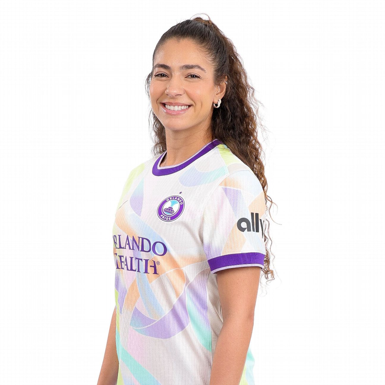
The Orlando Pride’s secondary kit, dubbed the “Unity Kit,” doesn’t capture the team’s usual vibrant energy. After previous eye-catching designs, this one blends into the background rather than stands out.
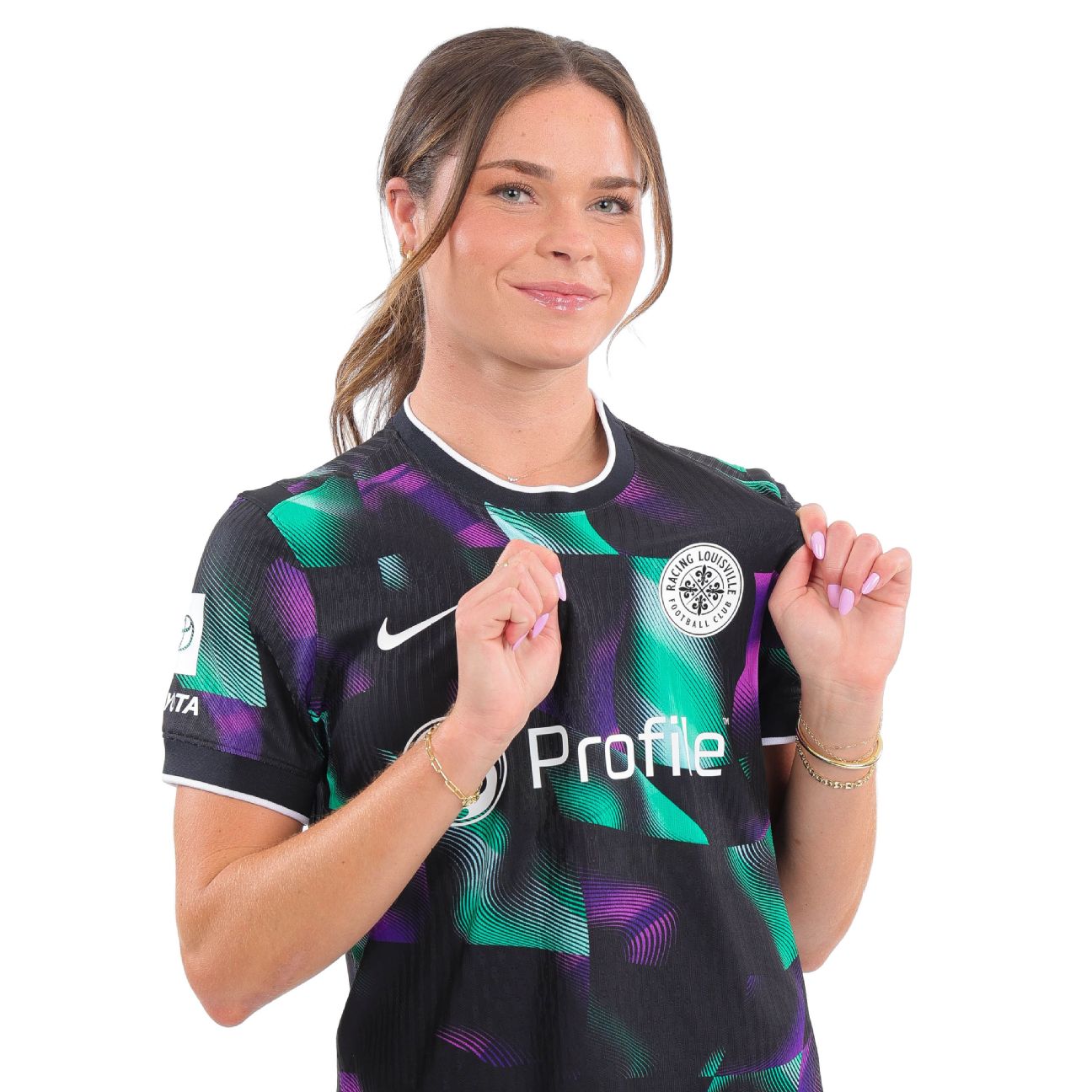
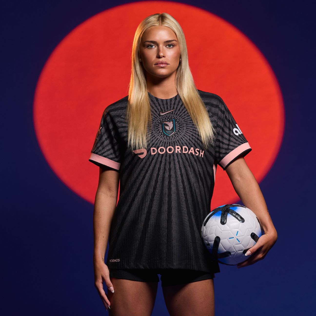
Taking risks with jersey designs can be hit or miss, but this year’s “Disco Kit” succeeds in its bold purple and green alternating patterns that reflect its namesake.

Now entering the top ten is the Reign’s “Surge Kit.” The two shades of blue create a striking contrast while harmonizing beautifully with the club’s logo. The design is said to symbolize “legacy in motion,” which, while somewhat subjective, evokes imagery of ocean waves that suit the coastal city.

The Thorns’ “Electric Bloom” kit, featuring intricate rose and thorn patterns integrated into the background, could have easily secured a spot in the top five during prior years. However, with stiff competition in 2026, it’s ranked lower this time. The vibrant yellow accents paired with their traditional red provide a fresh twist on the primary kit.
Cherry blossoms are a beautiful symbol of spring in Washington, D.C., yet D.C. teams have typically struggled to execute this concept well. Although the Spirit’s kit lands in the upper tier, it fails to capture the charm of the cherry blossom, with an overpowering green overshadowing the lovely pink and white elements. While the effort is commendable, the execution leaves room for improvement.
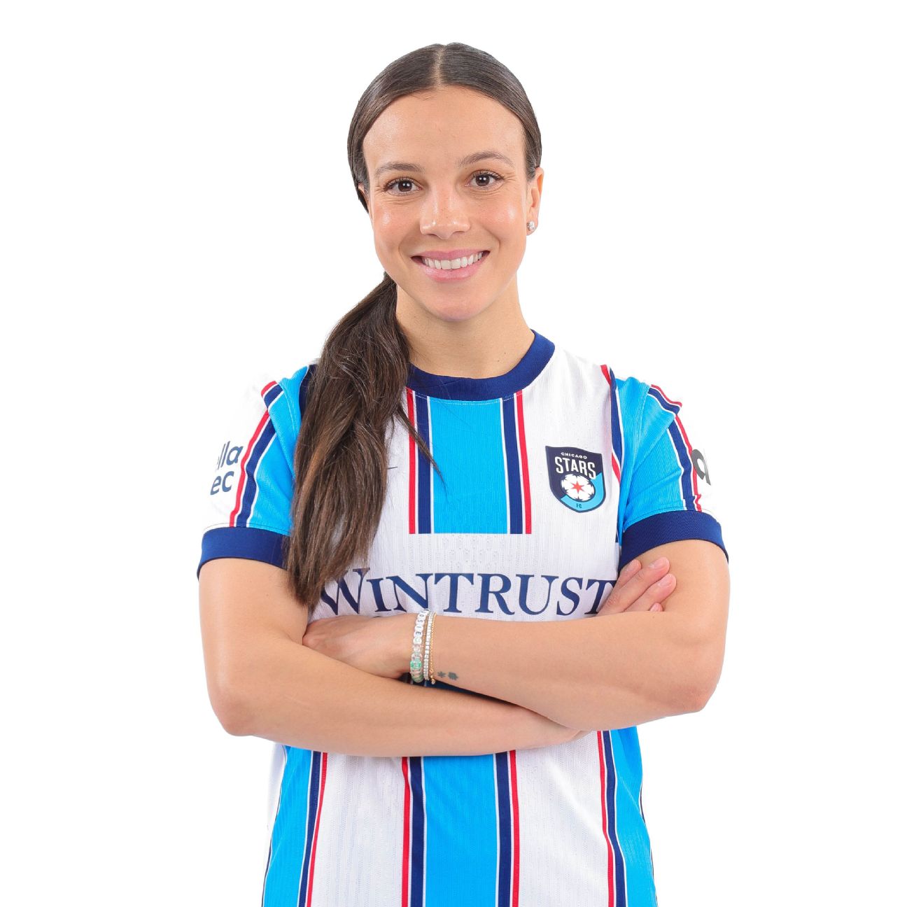
The Chicago Stars nailed their primary kit’s essence with a straightforward design. It effectively maintains brand recognition without becoming overly complex. The color scheme corresponds to the city’s flag, making it an unmistakable Chicago jersey that fits well into the current “blokecore” trend.

With the “Become Kit,” the Courage brilliantly merges art with soccer. The color scheme and design elements convey a new direction for soccer jerseys, while ensuring fidelity to the team’s identity. Featuring a Venus flytrap, North Carolina’s official carnivorous plant, the design pays homage to its local roots.
The “Storm Kit” from this innovative line didn’t disappoint with its striking design. As with many third kits this year, it’s unfortunate that fans won’t see this jersey more frequently on the field. A formal request to make this the secondary kit would be warranted!
Another team excelling in color usage has produced a jersey that skillfully guides the eye towards the crest, beautifully complementing the club’s design with its “Flare Kit.” Called a “sol rosa sunburst,” the motif stands out as one of the year’s highlights, particularly following the high standards set in 2025.
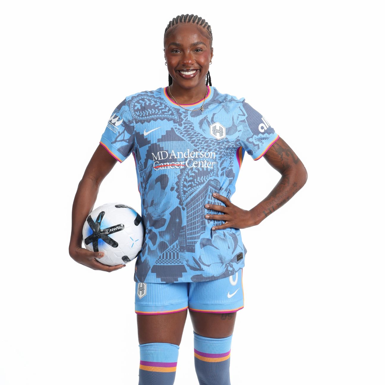
Dubbed the “Houston Chronicles,” this kit exhibits the successful cohesion that Boston Legacy aimed for. It masterfully reflects multiple aspects of city culture, achieving that balance without being overwhelming. Given its standout quality, the question arises: Why is this only the third kit? It deserves to see the pitch more often!
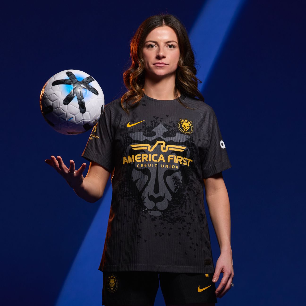
Simple yet stylish, the only enhancement needed for the “Swarm Kit” would be relocating the sponsor away from the lioness to elevate it to a primary kit. The imagery of bees surrounding the lioness adds a creative twist that distinguishes it from other feline-themed jerseys.
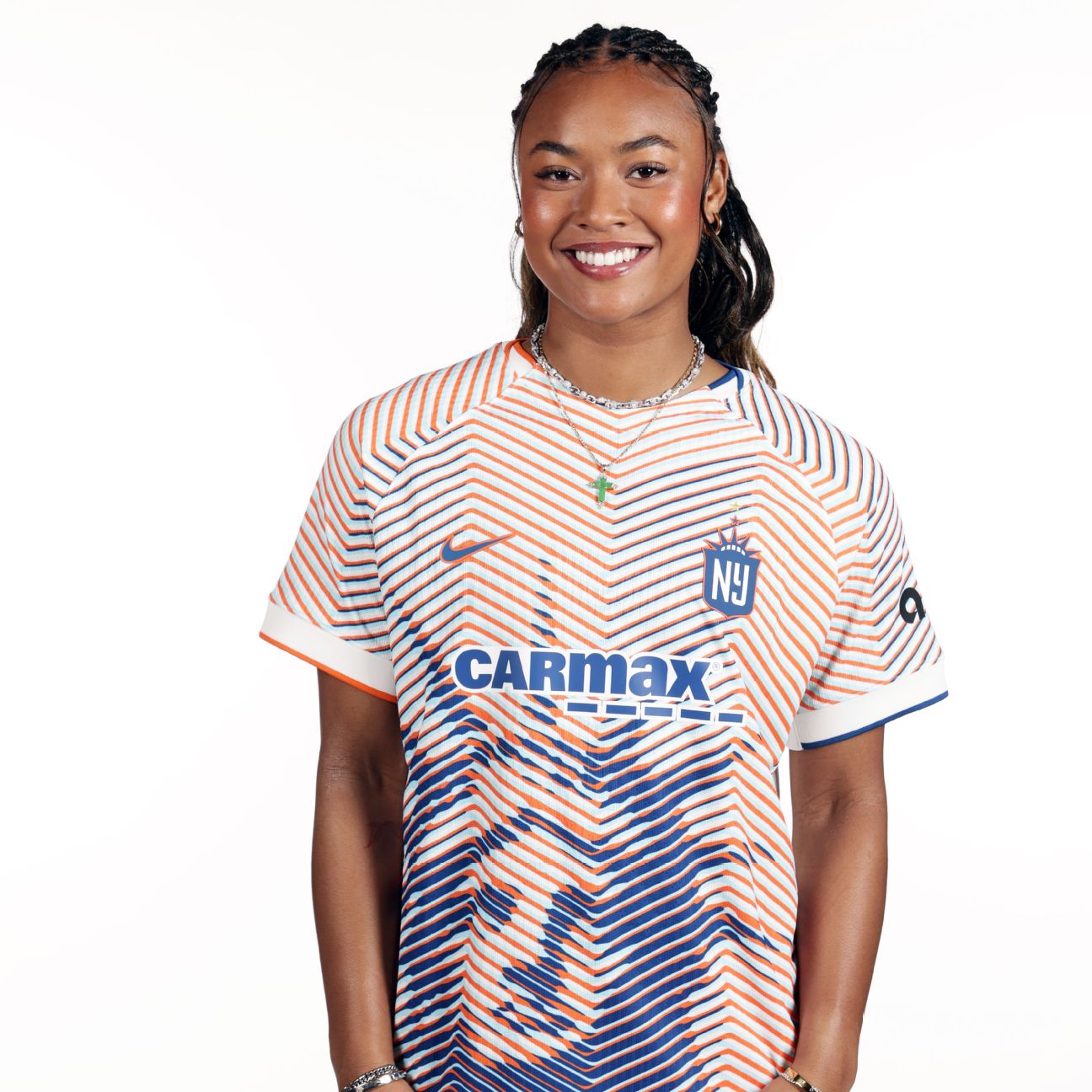
Gotham’s reimagining of an iconic New York monument showcases how to infuse a classic concept with innovative design. This jersey is ideally suited as a third kit, offering a fresh take on a familiar symbol while staying true to the team’s identity. Additionally, the colors reflect the New York City flag, a fantastic touch for fans who support both the Mets and the Knicks.